


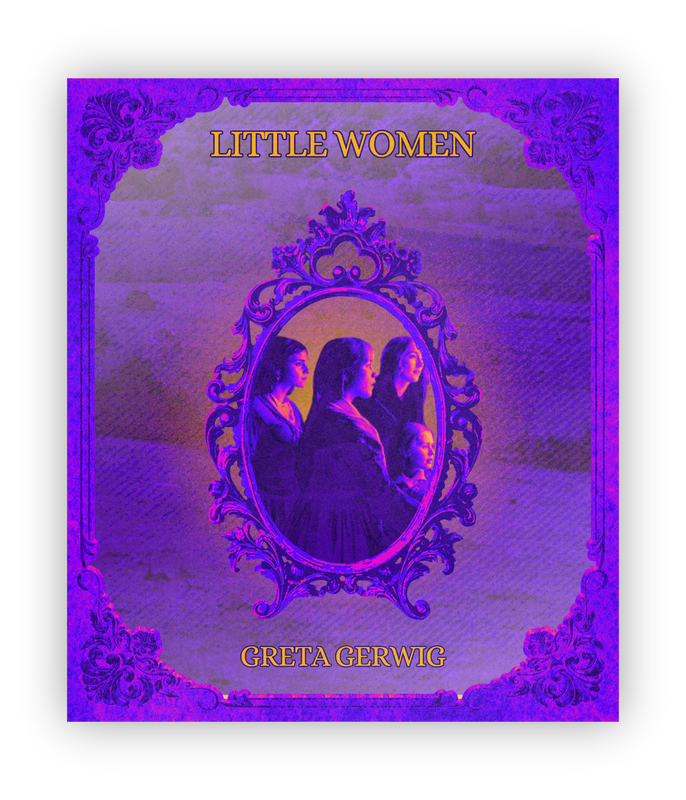
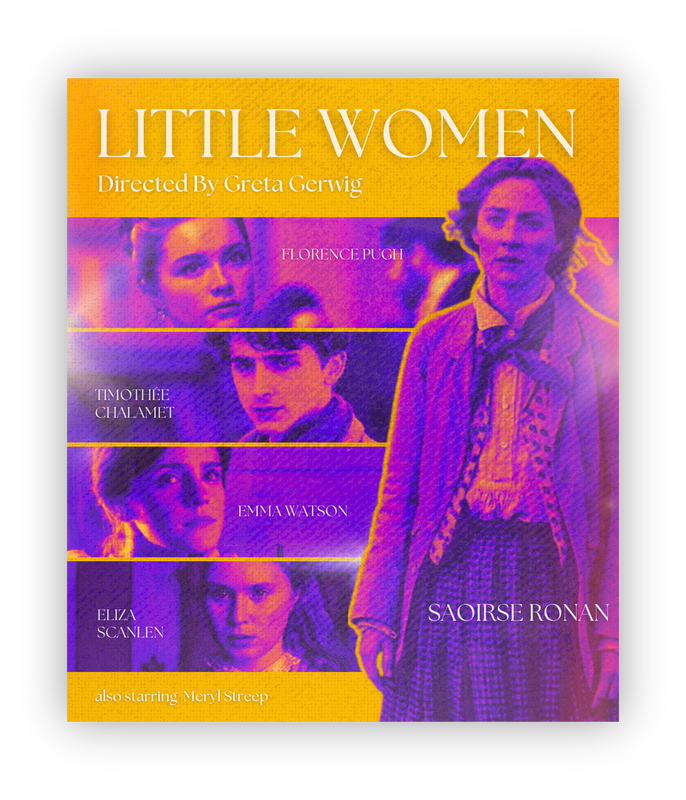
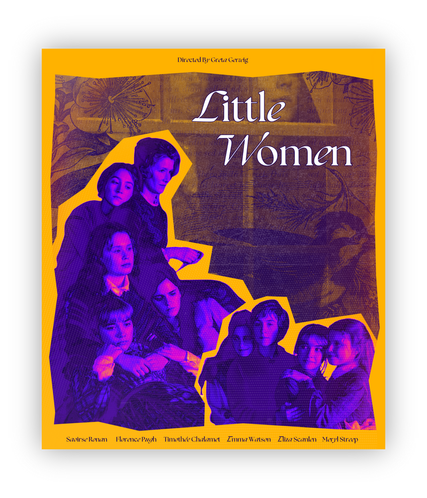
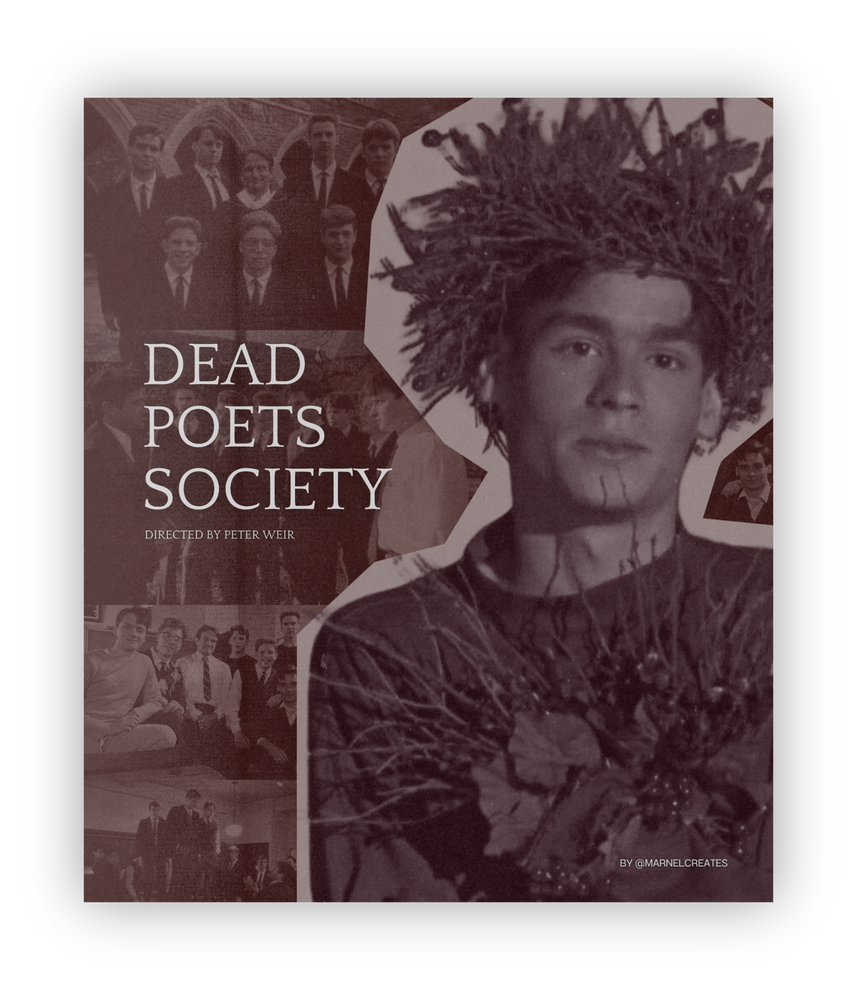
marnel
marnel
marnel
florentino
florentino
florentino
PORTFOLIO
PORTFOLIO
PORTFOLIO


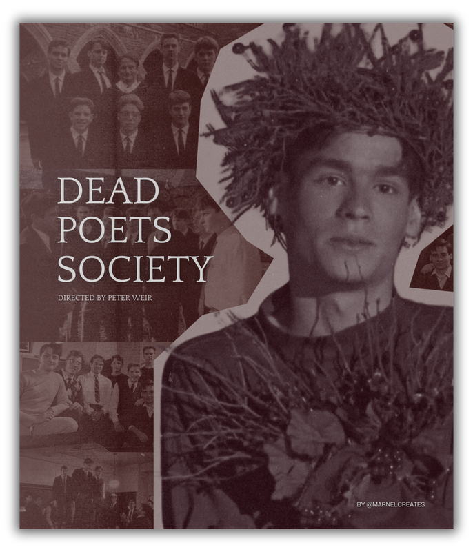
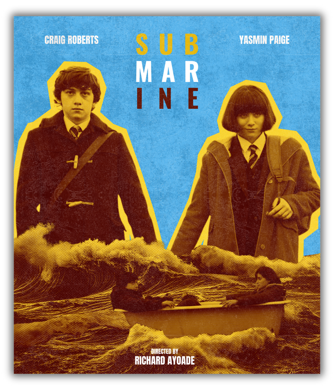
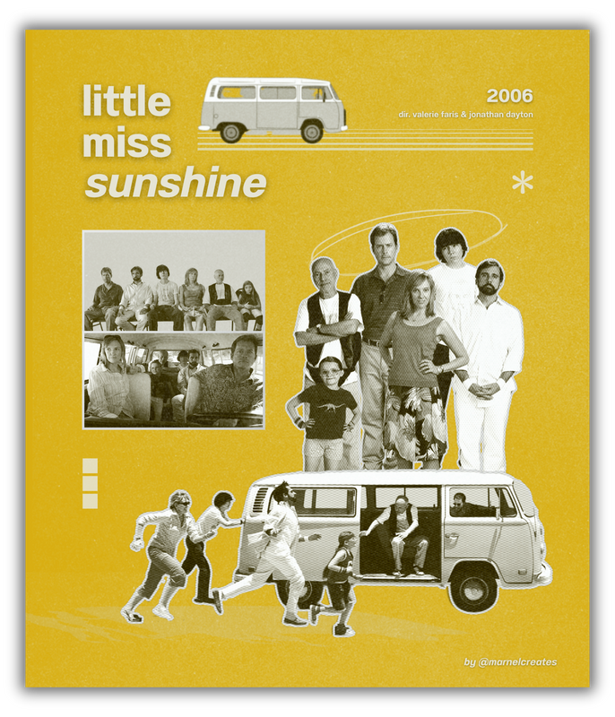
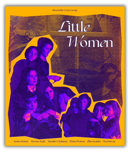
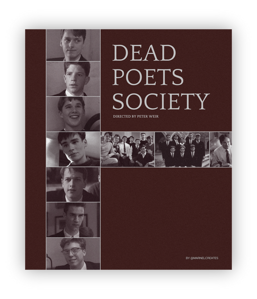
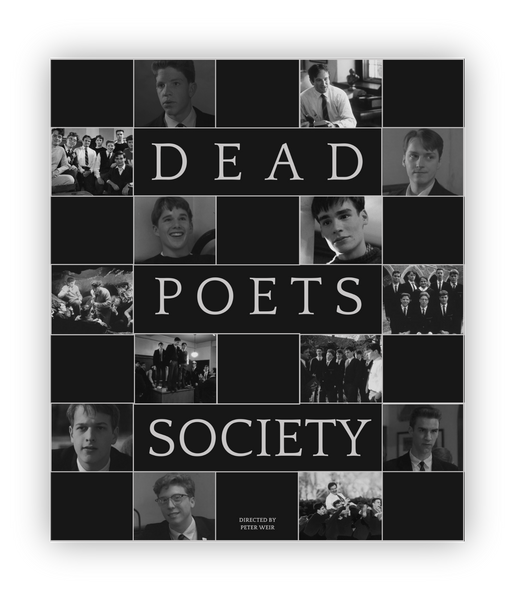
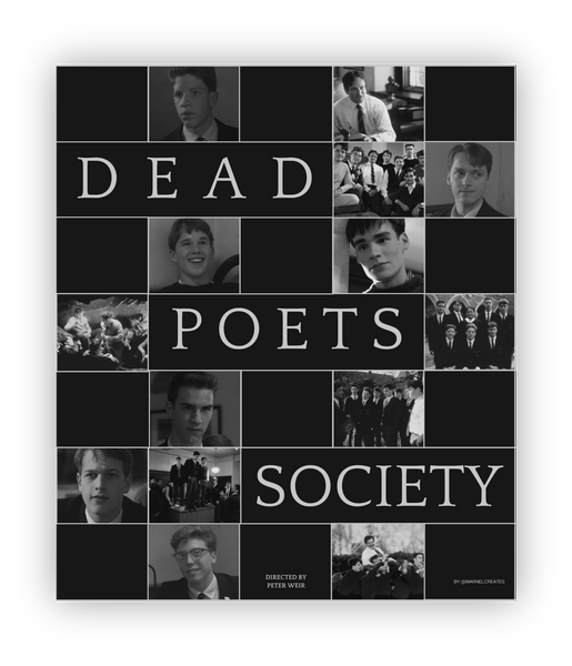
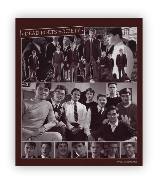
To start, I am showing you some of the POSTERS that
I made for my creatives account - @marnelcreates.


PRINT LAYOUT
SAMPLES


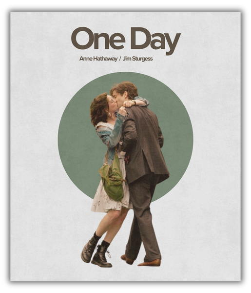
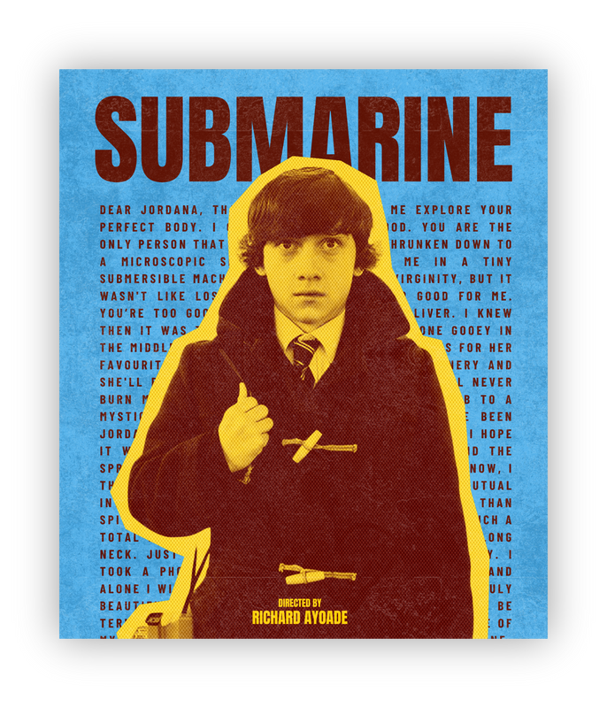
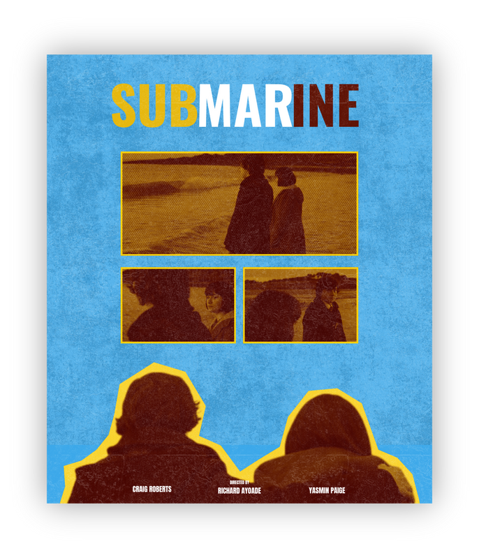
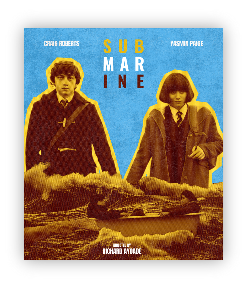
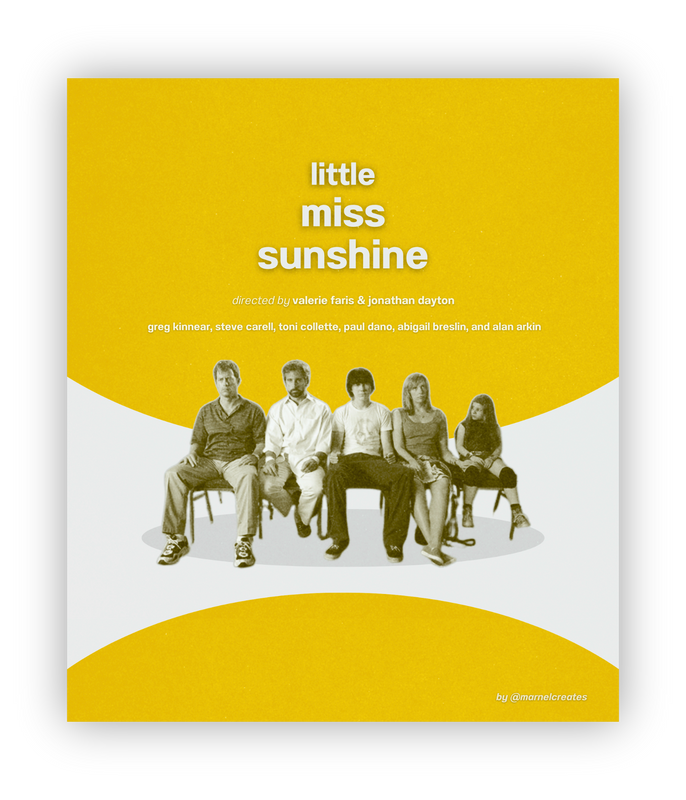
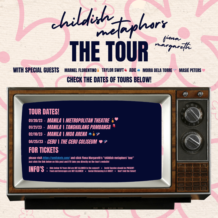
Sample 1: CONCERT TOUR POSTER
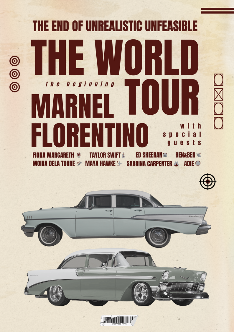
Note: This is just a sample of a tour concert poster.
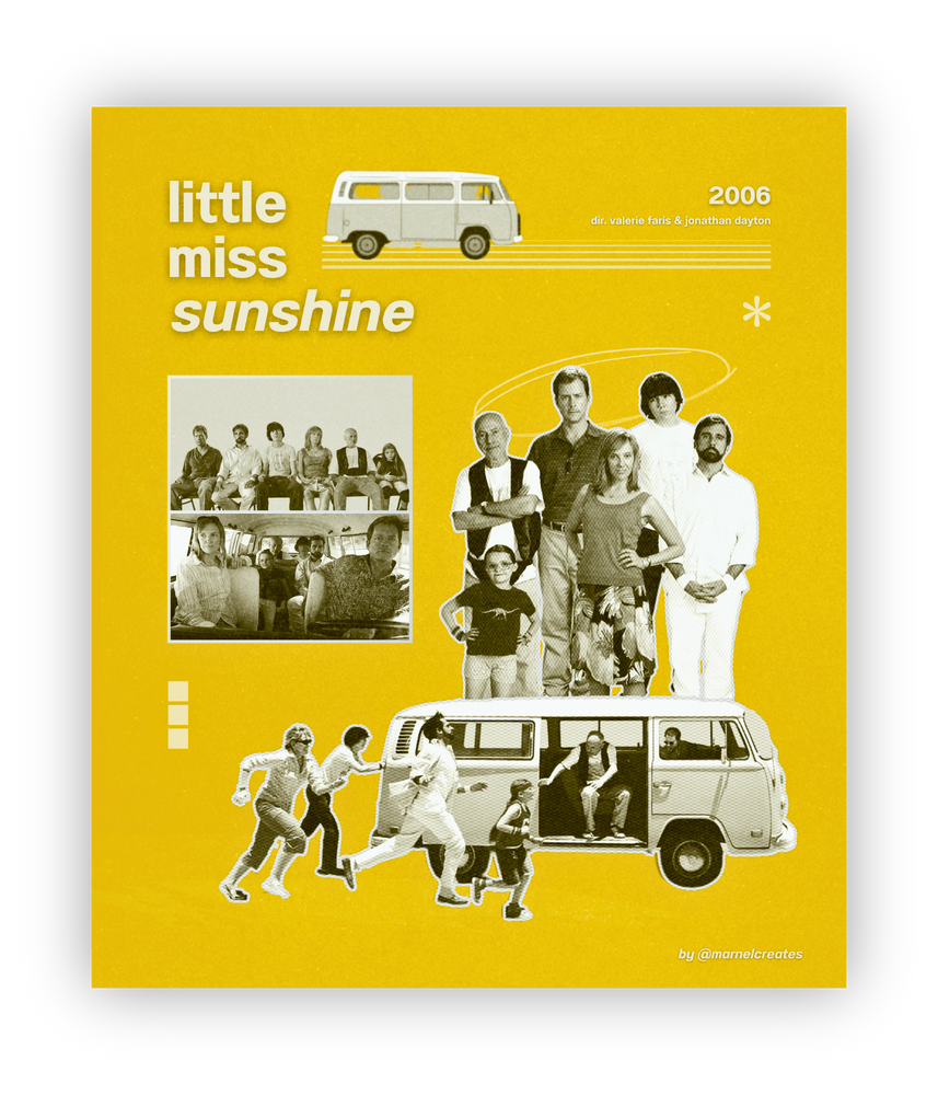
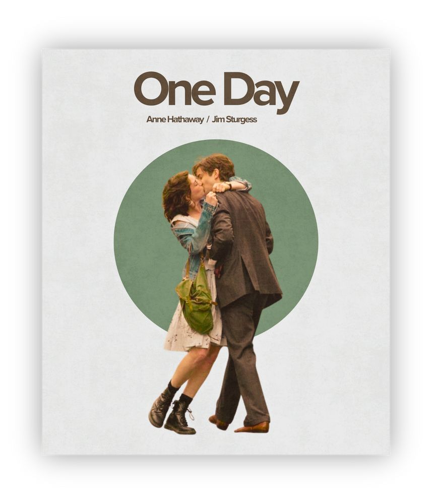
Sample 2: cd - disc layout
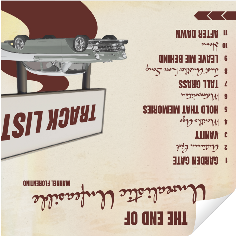


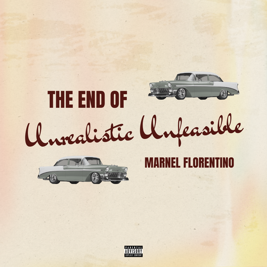
Note: This is just a sample of a CD Disc packaging layout.

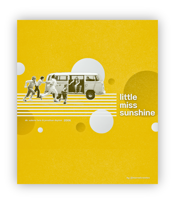
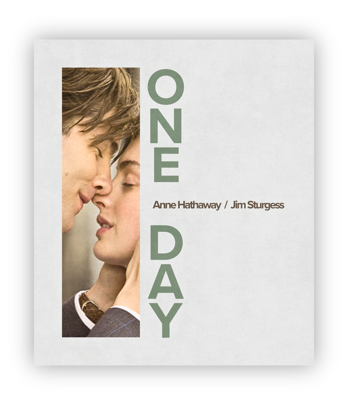
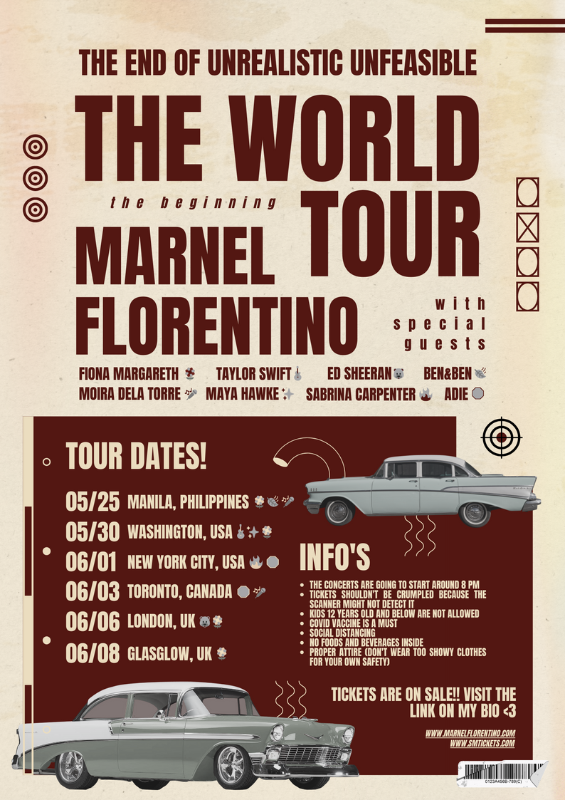
Sample 3: CONCERT TOUR POSTER
Note: This is just a sample of a tour concert poster.
index
LOGO & BRANDING
SAMPLES
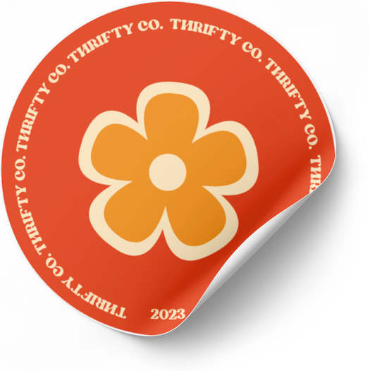
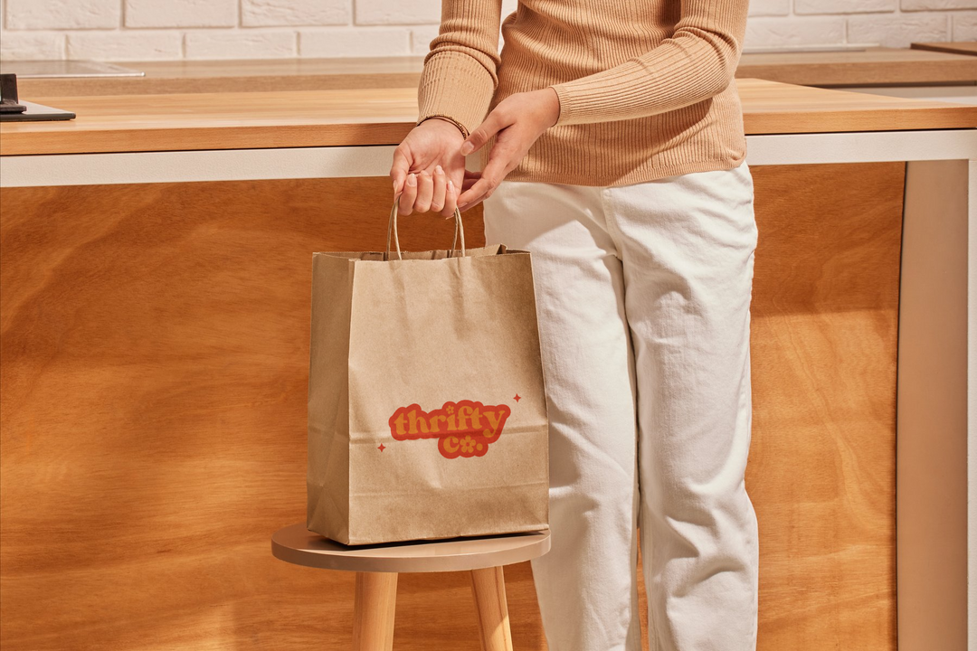
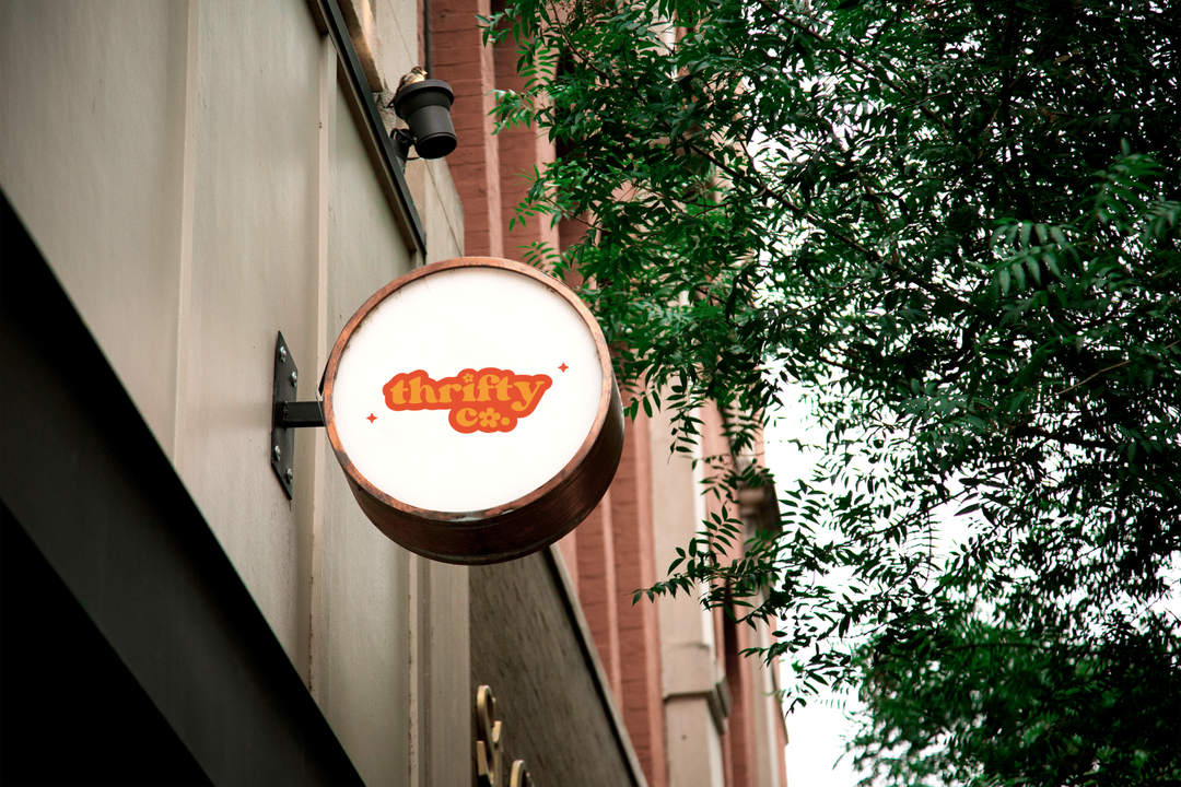
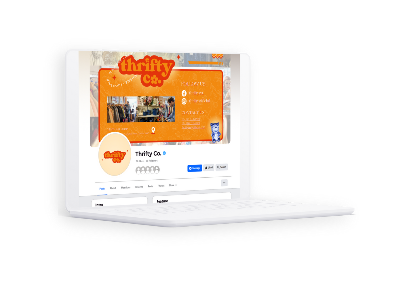
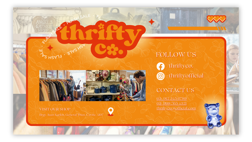
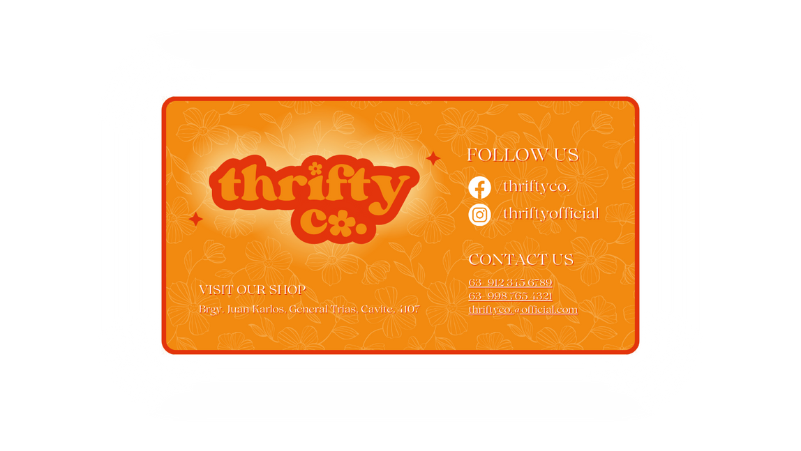
thifty co.


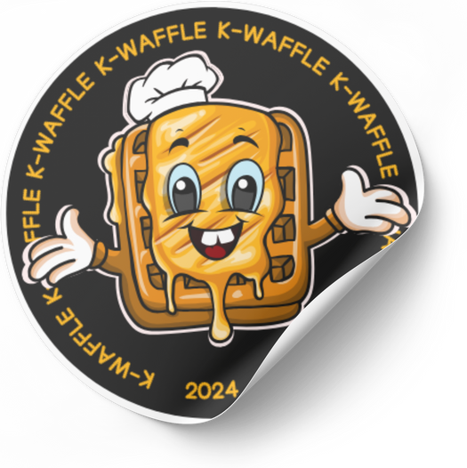
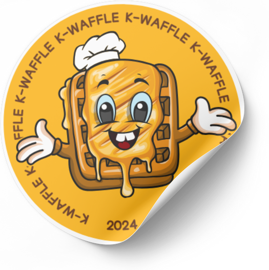
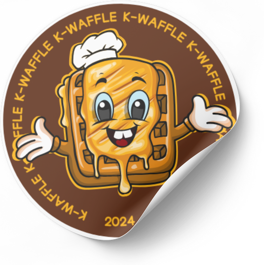
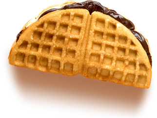
K-WAFFLE
primary logo


logo mark


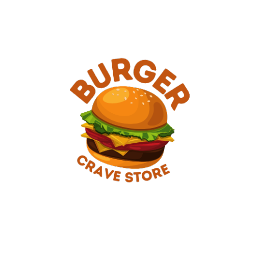
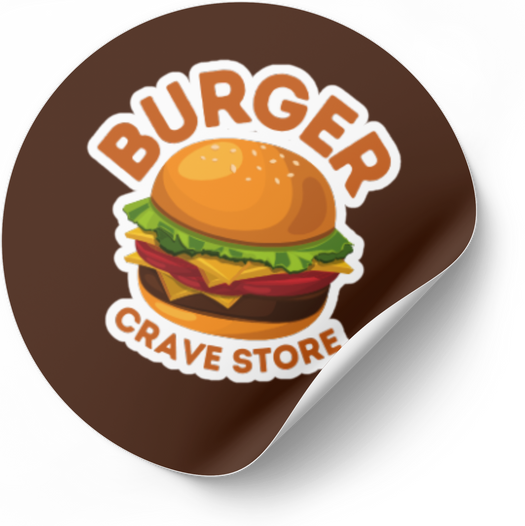
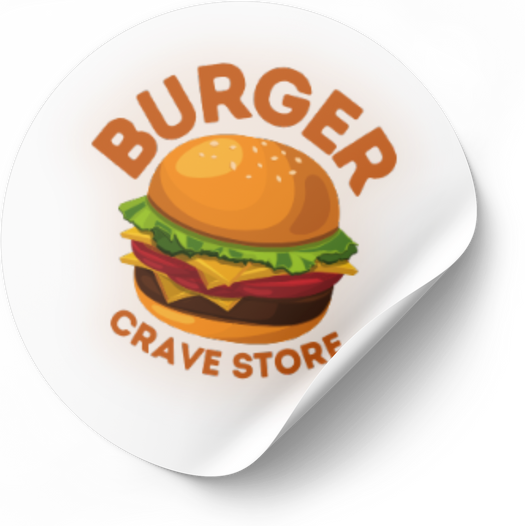
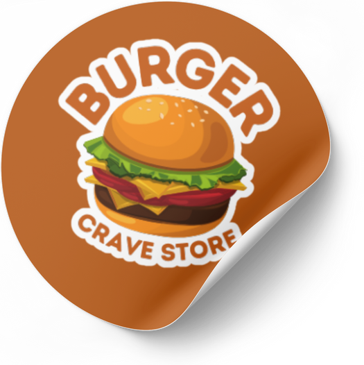
burger crave

index
templates
social media posts
(samples)

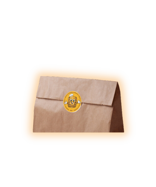
k-waffle layouts
In our 12th-grade ‘Entrepreneurship’ project, I created templates for our business proposal.
To make it visually engaging, I opted for the classic colours associated with a waffle business – Yellow and Brown. Additionally, I incorporated a charming Korean font that complements the overall aesthetic of the design.


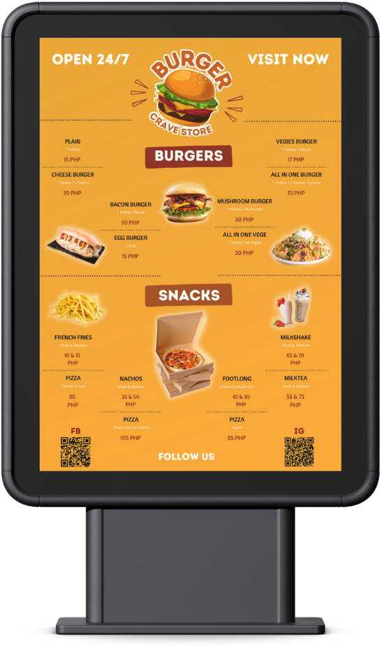
Burger crave
Menu layout
For this menu layout for Burger Crave, I used the colours that signify the store's brand. The fonts that I used are Intro Rust and Arial.
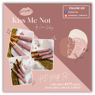


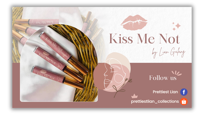


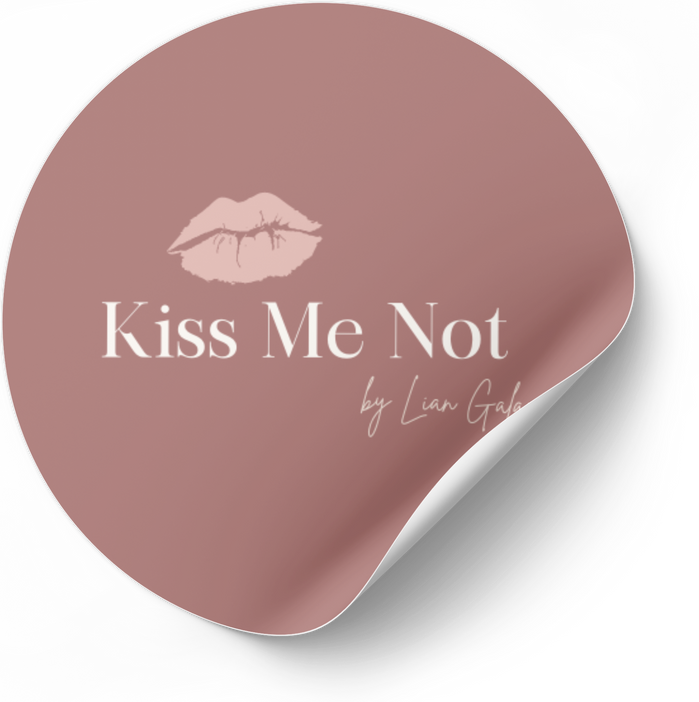
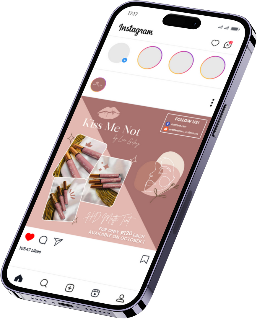
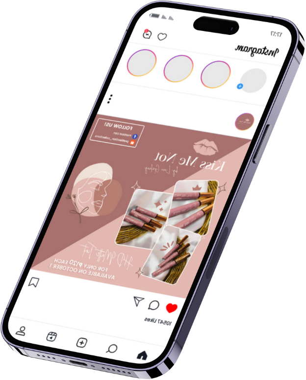
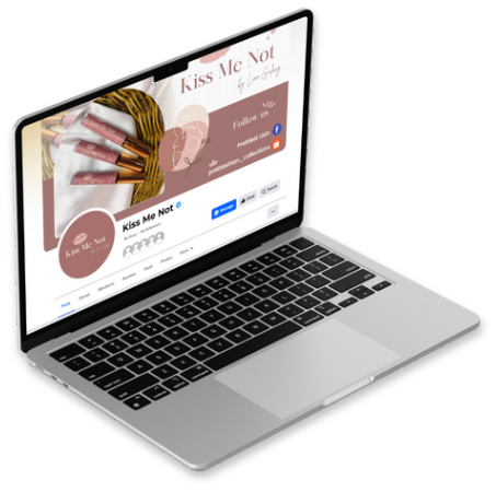
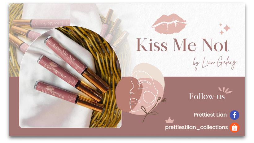
kiss me not
The client has asked for a straightforward design for their business logo, specifying the hex colour.
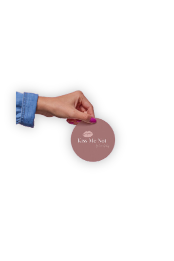
To keep it minimal yet sophisticated, I incorporated a lip symbol that represents their brand and used elegant, bold, and classy fonts.
SOCIAL MEDIA POST


COVER PHOTO


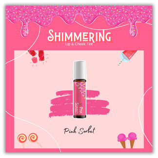
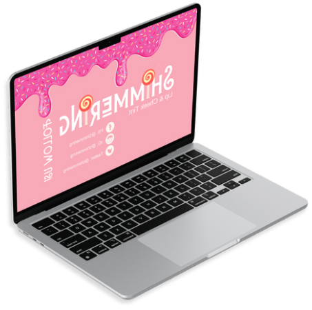
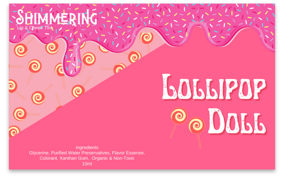
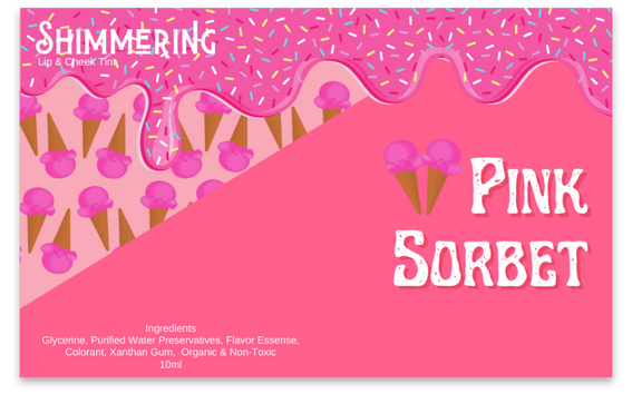
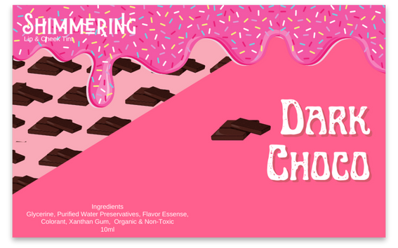
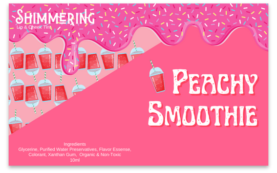
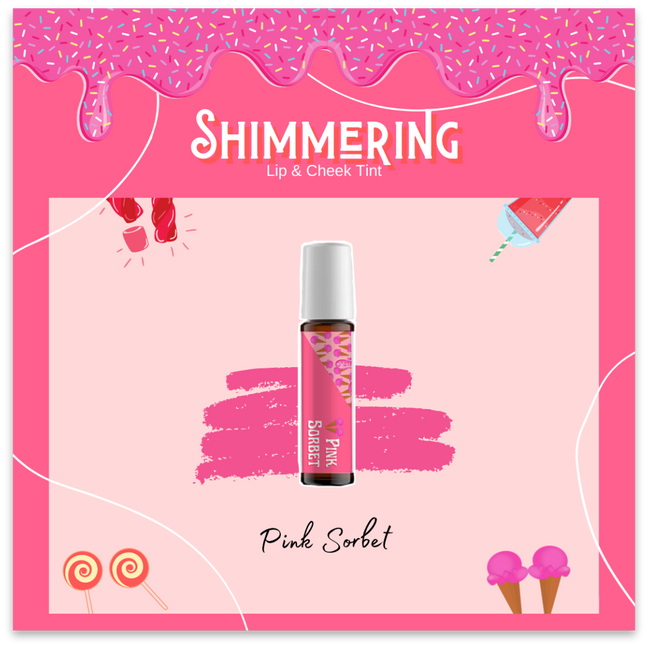
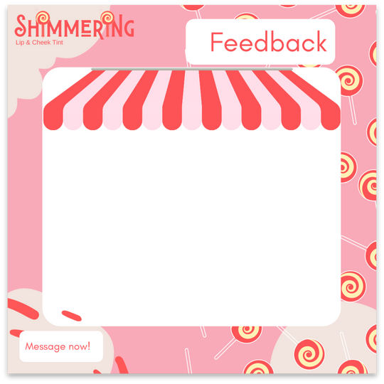
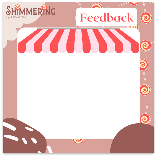
shimmering
lip & cheek tint
For this project, I incorporated pink as the primary colour and included elements representing the client's products, such as candy and dripping ice cream, to align with their brand. To enhance the enchanting theme, I selected a font reminiscent of fairy tales and paired it
with a white background to create a striking contrast with the pink colour.
The overall design is focused on simplicity yet exudes an adorable charm.
cover photo
liptint packaging layout


social media post layouts


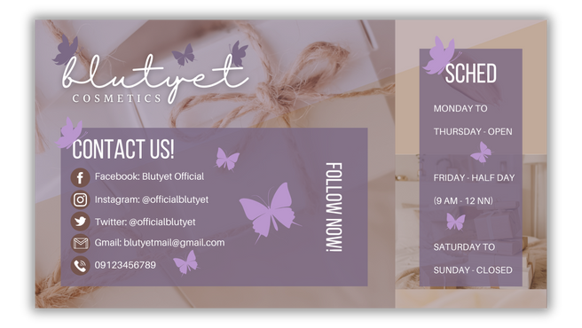
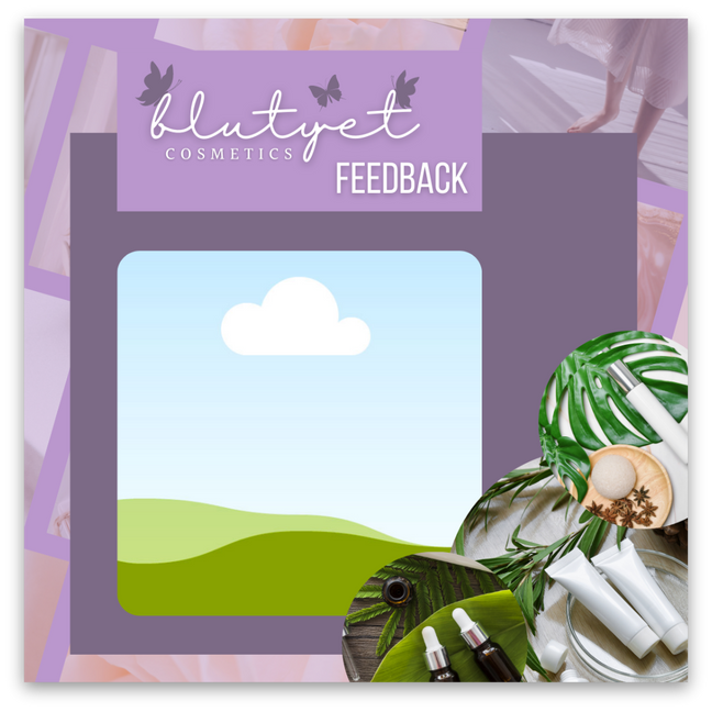
blutyet
cosmetics
After understanding the client's vision and theme, I designed the layouts with pastel colors as the main palette and white fonts for clarity. The resulting designs are soothing, gentle, and visually appealing.
social media post layout
(feedback template)
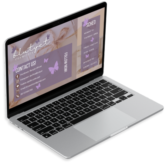
cover photo


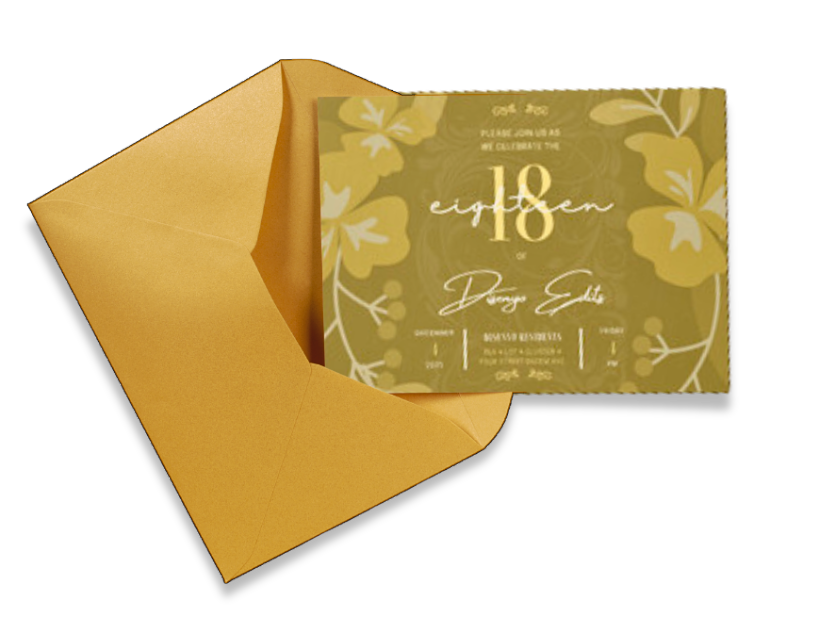
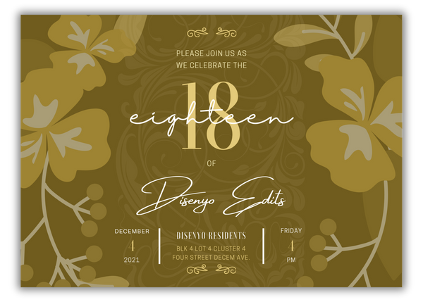
invitation card
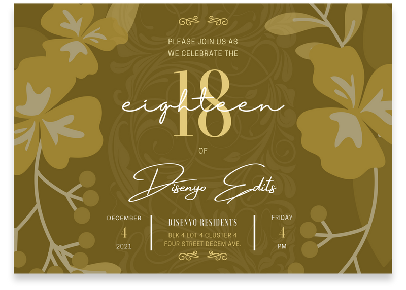
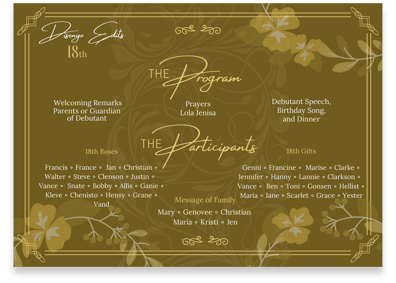
Have a look at this debut invitation card mock-up I created with a Gold theme. The design incorporates formal elements like borders and textured background elements. The front page features essential details such as the debutant's name, venue, date, and other key information. The second page outlines the program flow and participants involved.


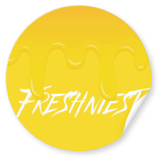
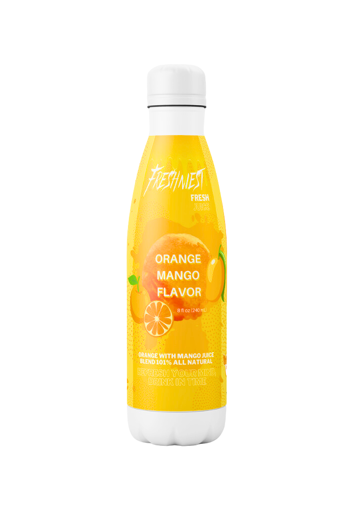
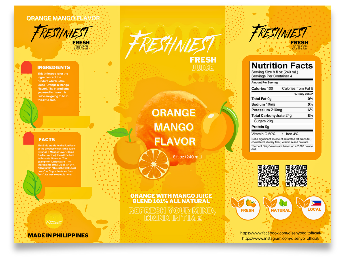
freshniest
This mock-up packaging design for a juice bottle comprises three main sections:
- The center section contains the flavour, company logo, and an attention-grabbing tagline for potential buyers.
- The left and right sides provide details on the juice's ingredients, production origin, and other product information.
Overall, the layout is clean and visually appealing, ensuring that essential information is easy to find and read. The colour scheme is vibrant yet balanced, reflecting the freshness and natural quality of the juice.
LOGO
product packaging
product thumbnails
These are the product thumbnails that I have made for my clients. Product thumbnails are used in any online shopping site to catch the buyer’s attention to the product. Each thumbnail is carefully crafted to highlight the unique features and appeal of the product it represents. The goal is to create an immediate visual impact that encourages potential buyers to click and learn more. From high-resolution images to vibrant colours and clear, concise labels, every element is designed to communicate the product's value quickly and effectively.
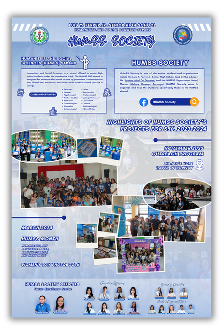

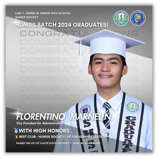
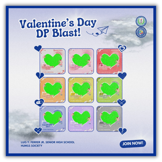
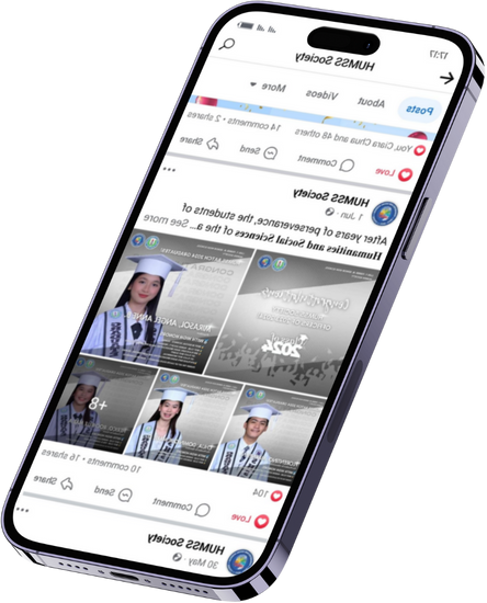
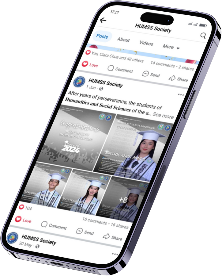
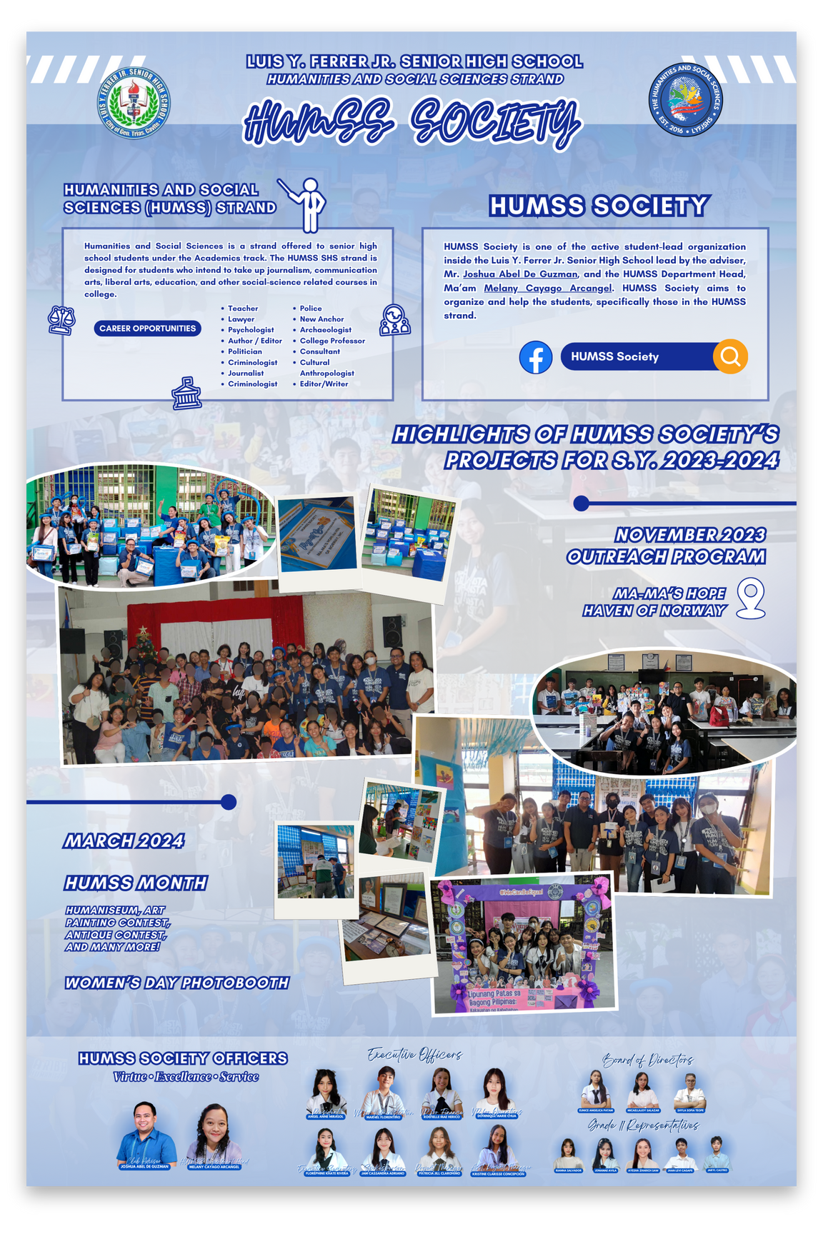
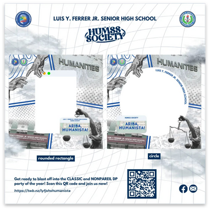
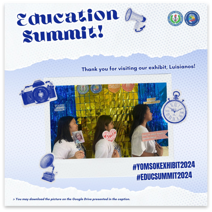
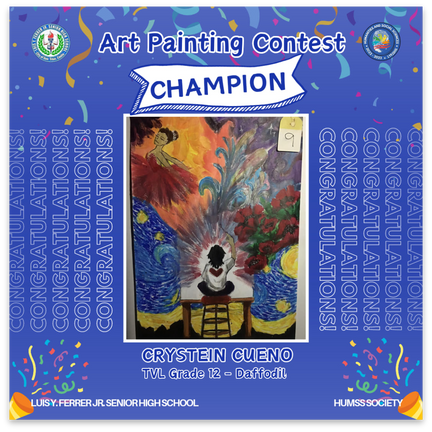
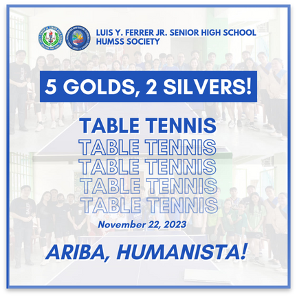
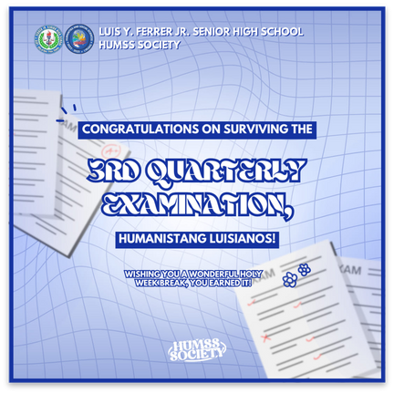
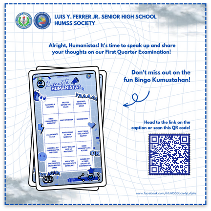
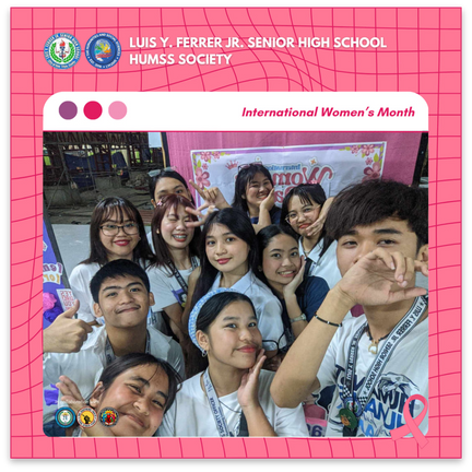
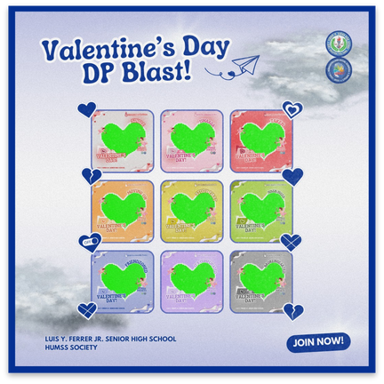
HUMSS SOCIETY
As the Vice President for Administration of the HUMSS Society, I took on the responsibility of creating publication materials voluntarily. I edited and crafted informative and engaging materials, ensuring clarity, visual appeal, and creativity in each piece.

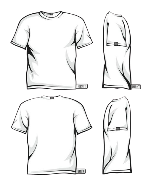

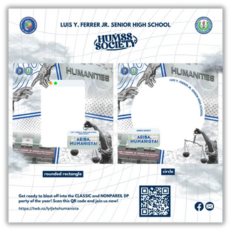
t-shirt design layout
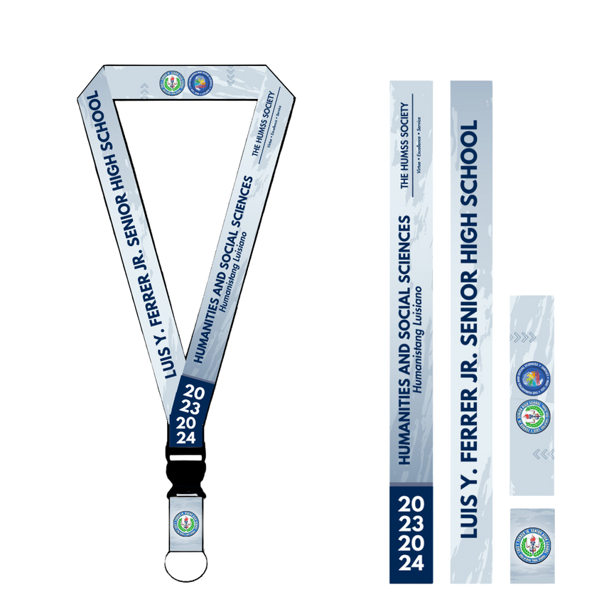
lanyard design layout
> Visit HUMSS Society’s Facebook Page for more publication materials.

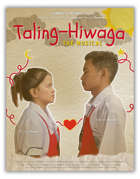
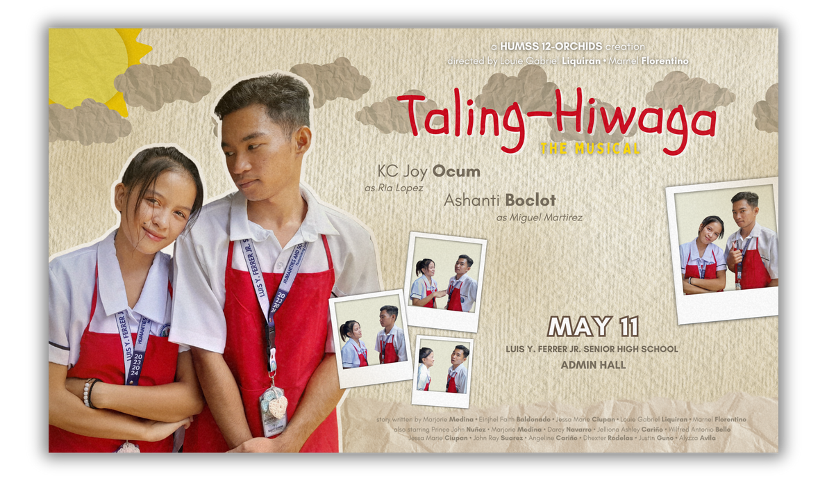
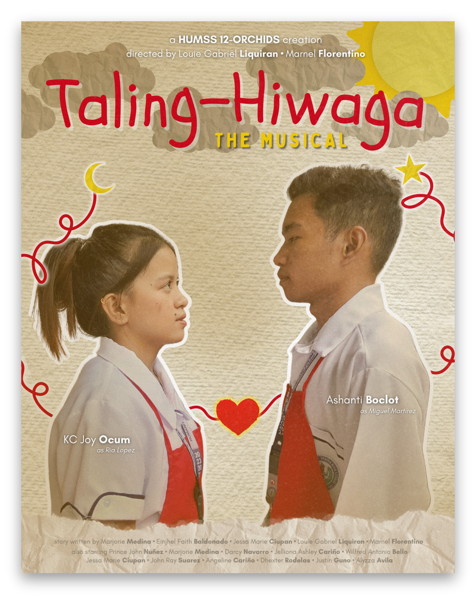
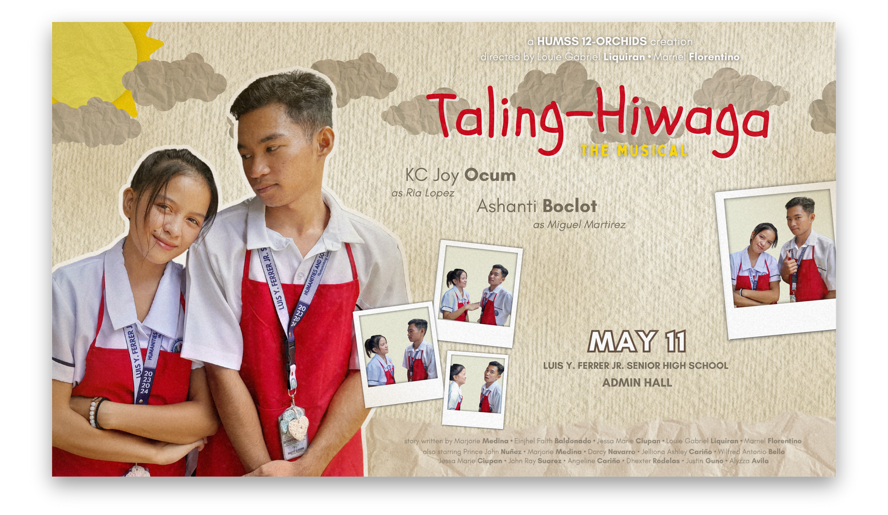
taling-hiwaga: the musical
I volunteered to do the official poster for our Culminating Activities’ Theater Play since I was one of the directors. For this one, I made it just cute and whimsical, capturing the playful essence of our production. I used bright colours and hand-drawn illustrations to give it a unique, personal touch. The characters were depicted with exaggerated expressions, and the background was filled with stars and sparkles to evoke a sense of magic and excitement. The title of the play was written in a bold, fun font that instantly drew attention. For the cover photo, I included all the necessary details like the date, time, and venue at the bottom, framed with decorative borders.

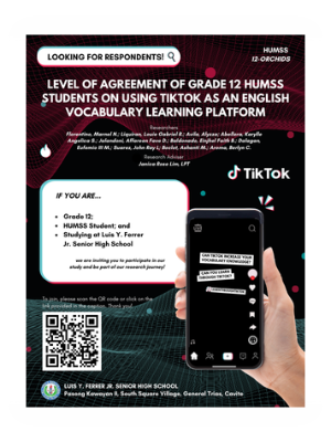
RESEARCH-RELATED PUBMAT
Since I was the leader for our research subject, I opted to do the pubmat that we posted to look for our respondents. This poster is made with vibrant colours and eye-catching graphics to attract attention. It features a clear call to action, encouraging potential respondents to participate in our study. The text is concise and informative, providing all the necessary details about the research and how to get involved. We included images and icons related to our topic to make the poster visually appealing and relevant. Overall, the pubmat is designed to be engaging and effective in gathering the respondents we need to ensure the success of our study.
~ VIDEOS EDITED BY ME ~
Besides graphic design, I also find joy in video editing. Here are a few academic-related videos that I have edited.